The redesigned flow, in motion
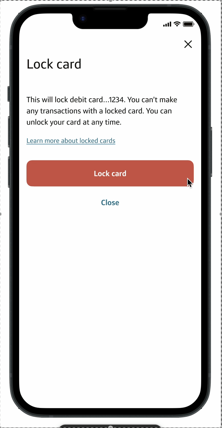
Locking a debit card is one of the most emotionally charged actions in the app. I reimagined a security-critical flow used 75,000 times a day to feel calmer and more trustworthy, and cut it from five taps to three.
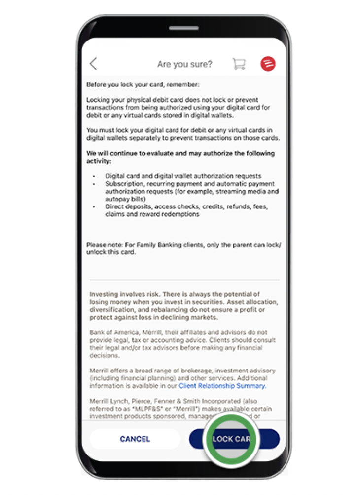
Customers arrive stressed. Locking or unlocking happens in urgent moments, suspected fraud, a misplaced card, and people want one thing: to know their money is safe. The old flow felt dated, feedback was heavy-handed, and success and exit actions were over-emphasized, adding cognitive load exactly when clarity mattered most.
The experience had fallen behind. Built years earlier, it no longer matched the design system or our Experience Modernization (xMod) standards. In a high-frequency, trust-critical interaction, that inconsistency was a business risk, eroding confidence and driving avoidable support calls.
Confusion in a security-critical moment is the one thing this flow could not afford.
Looking at other lock and unlock experiences made the opportunity clearer. The flows were doing a lot at once: dense legal copy, multiple moving parts, unclear hierarchy and long blocks of unformatted text.
The takeaway was not to add more explanation. It reinforced the opposite direction: clean up the content, reduce visual competition, and make the lock control the clear center of the experience.
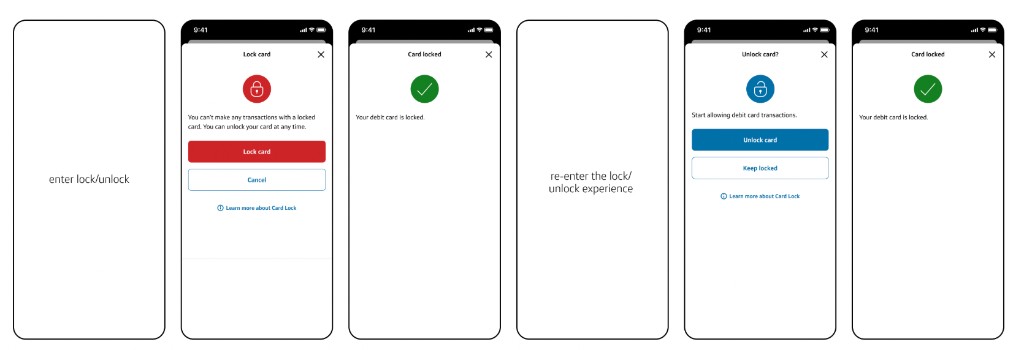
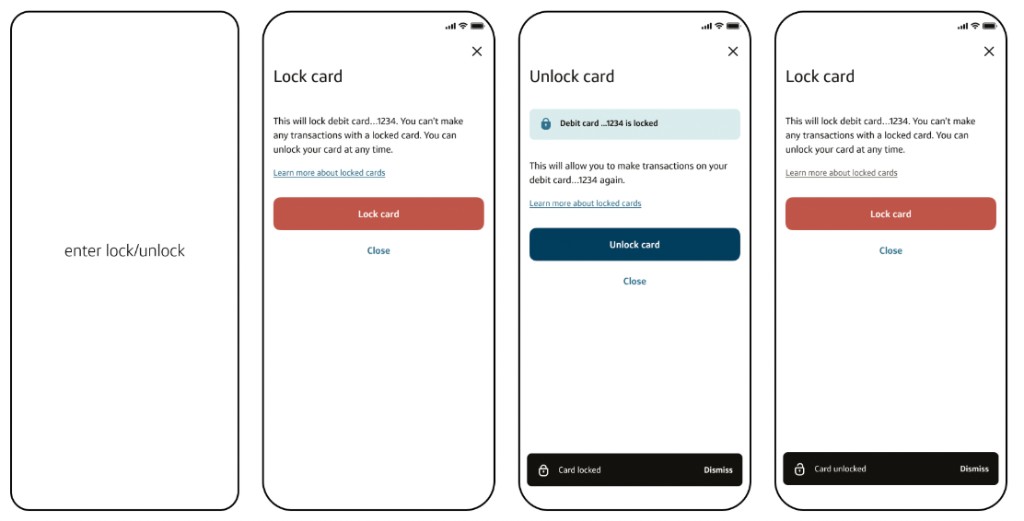
The old path split the task across more screens and forced customers back through the entry point. The redesign keeps the same job in one clearer loop.
Modernization couldn't stop at a fresh coat of paint. I aligned the flow to xMod standards, then reduced friction through deliberate interaction and content decisions.
Updated color, type and spacing, reduced iconography, and removed legacy visuals to bring the feature back in line with the system.
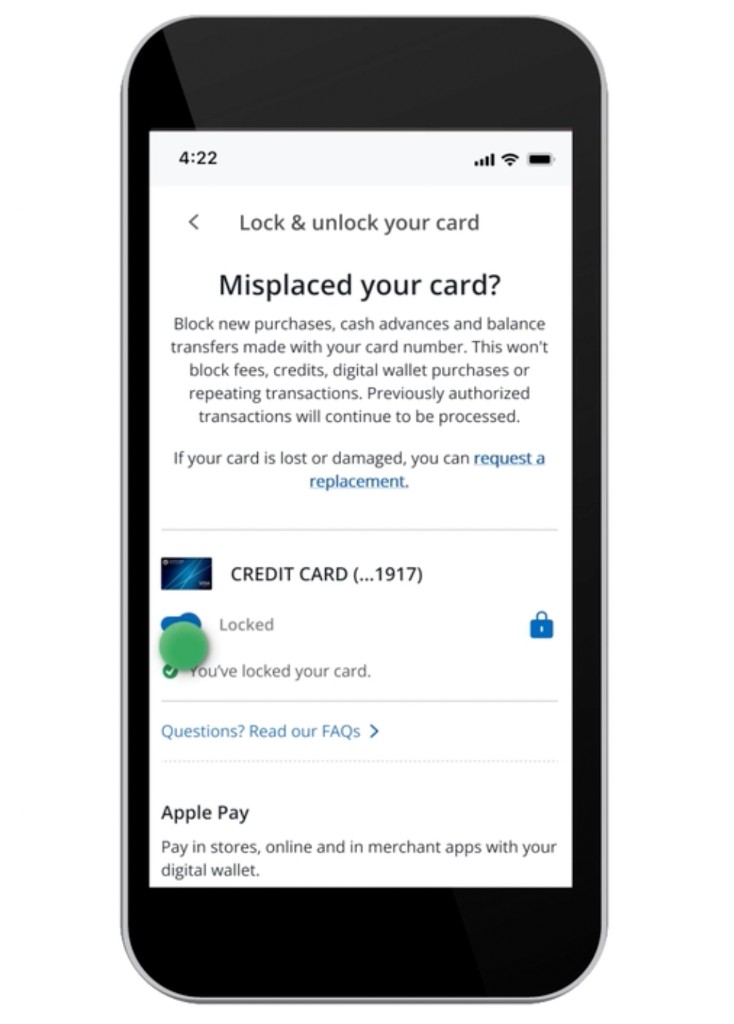
Replaced full-screen success confirmations with toast notifications, so customers get immediate feedback without losing momentum.
The screen already had a clear “X.” I demoted the prominent “Cancel” to a quiet tertiary “Close,” matching emphasis to intent.
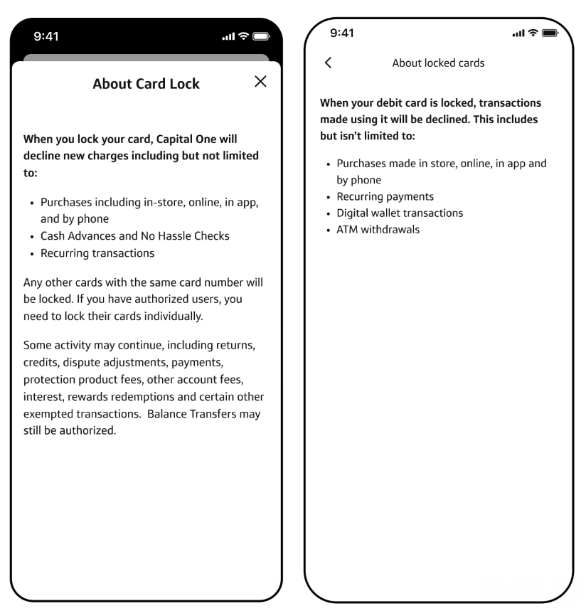
Cut “Learn more” down to what customers actually need in the moment, and removed credit-card legal language that never applied to debit.
Turned lock and unlock into a single toggle instead of exit-and-reenter, taking the task from five taps to three.
System-heavy language was rewritten to feel direct and human, naming the card and telling customers exactly what happens next.
You can't make any transaction with a locked card. You can unlock your card at any time.
Start allowing debit transactions.
This will lock your debit card …1234. You can't make any transaction with a locked card. You can unlock it at any time.
This will let you make transactions on your debit card …1234 again.
The refresh was the easy part. The judgment showed up in the details.
Much of the legal copy was inherited from credit and irrelevant to debit. Treating it as part of the experience served customers and compliance at once.
Emphasis should match why customers came. Exits got quieter, the primary action got clearer, and the screen stopped competing with itself.
Research showed some customers lock and unlock to manage spending, so the toggle rewards repeat use instead of punishing it.
A calmer, clearer flow that reinforces trust without adding a single step, now live and evolving in production.
Happy to walk through the before and after screens and the decisions behind them.
Let's chat