A massive, living system powering every Capital One digital experience. These are the four pillars I shaped to make it functional, adoptable, understood and trusted.
Design at Capital One is intentionally segmented: many teams, many features. A real enterprise system has to hold all of that together, which is less about screens than about four things that decide whether a system actually gets used.
Tooling, contributions, education and documentation. That's how a company designs together.
A component isn't done when it looks good. It's done when it's functional and easy for another designer to pick up and use correctly.
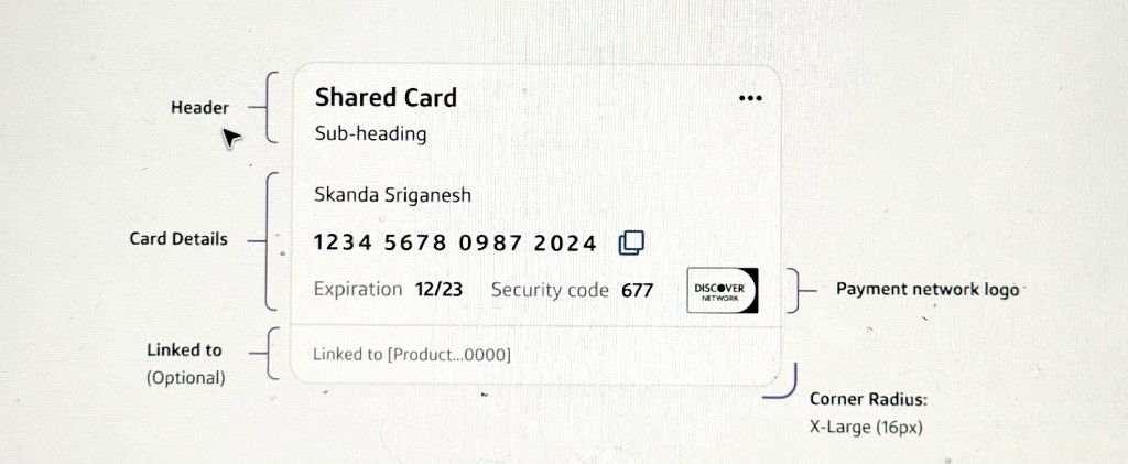
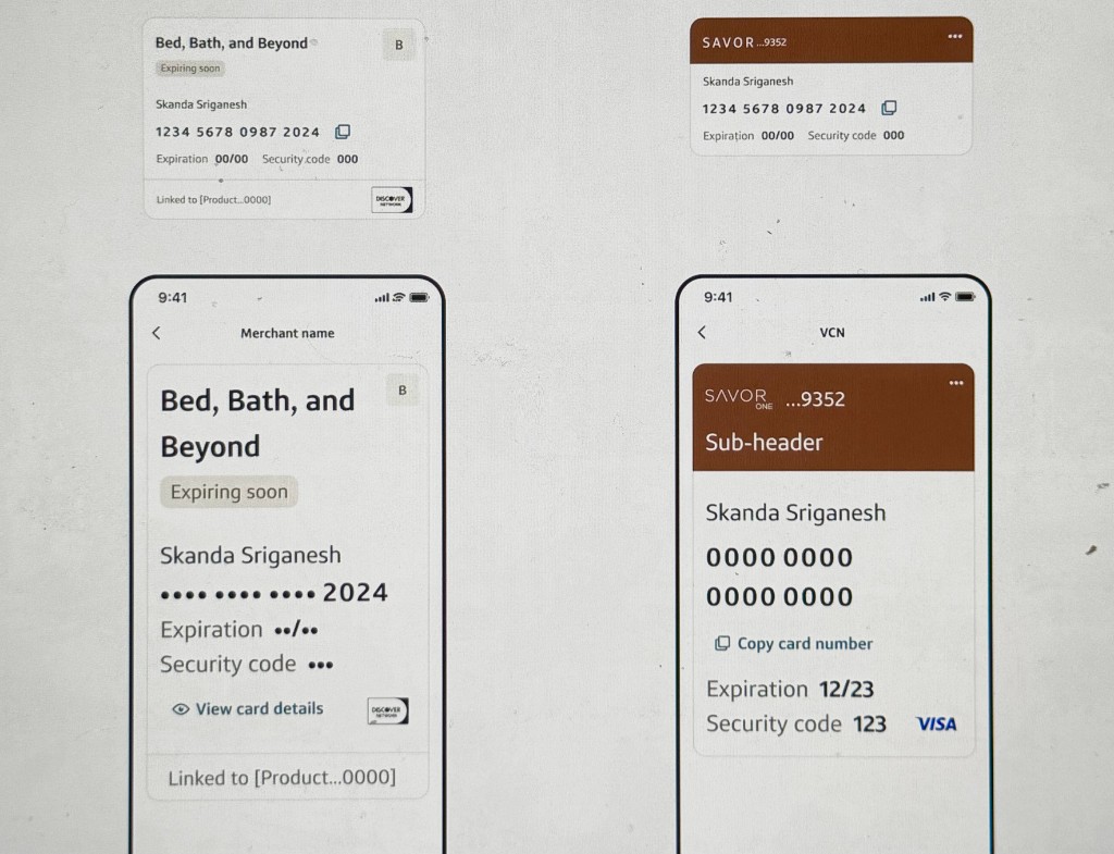
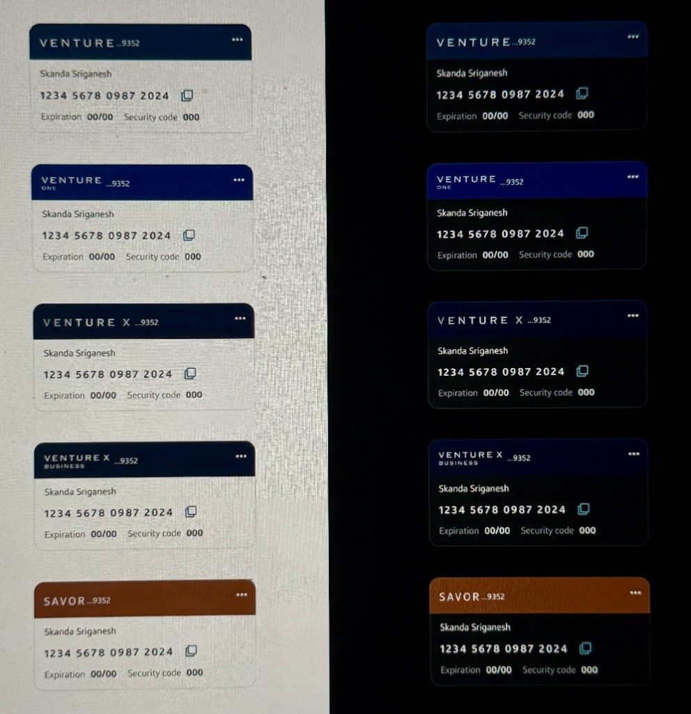
The payment-card component is the clearest example of that approach: one reusable structure, many states, holding up across products, platforms and languages while staying scannable. Everything is built right from the start.
All styling driven by tokens, so the system stays consistent and can shift globally without rework.
Reflow and theming handled by default, not bolted on after the fact.
Accessible color and behavior inherited by every component, every time.


Before this, every team was inventing its own patterns for its own features. A natural consequence of how segmented design is here, but a recipe for drift.
From an enterprise seat, I built a contribution funnel for the Capital One app's local design system: clear criteria a pattern must meet to graduate to the official kit, and a place for new patterns to prove themselves first.
A defined bar a pattern must clear before it becomes an official, supported component.
A dedicated file where new patterns can grow, iterate and be adopted by teams before promotion.
Evidence presented to make the case for graduation, so decisions aren't taste alone.
You can build the best components in the world, but if you don't teach consumers how to use them, there's no point.
So a real part of the role is getting everyone speaking the same language: the people adopting new platform direction and the designers just starting out.
Led education on the latest native direction Apple is mandating, so teams adopt it correctly.
Kicked off the basics for new designers: what a design system is, what tokens are, and the shared vocabulary that makes enterprise design possible.
To support a system at scale, you need resources good enough that most questions answer themselves. I wrote and refined a lot of that documentation at Capital One, to a high bar as considered as the components themselves.
I also worked on the system's icons and illustrations along a deliberate spectrum. Each app can define what its functional end looks like and what its expressive end looks like.
The system supports both, with documentation to keep them coherent rather than accidental.
Happy to walk through the funnel, the curriculum, the documentation bar and how it holds up in production over a call.
Let's chat